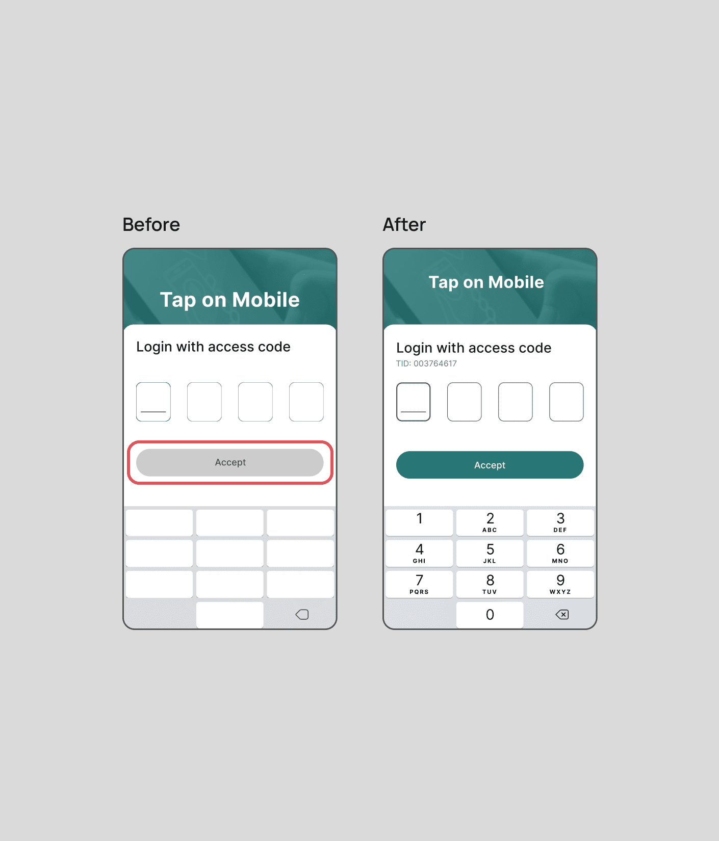
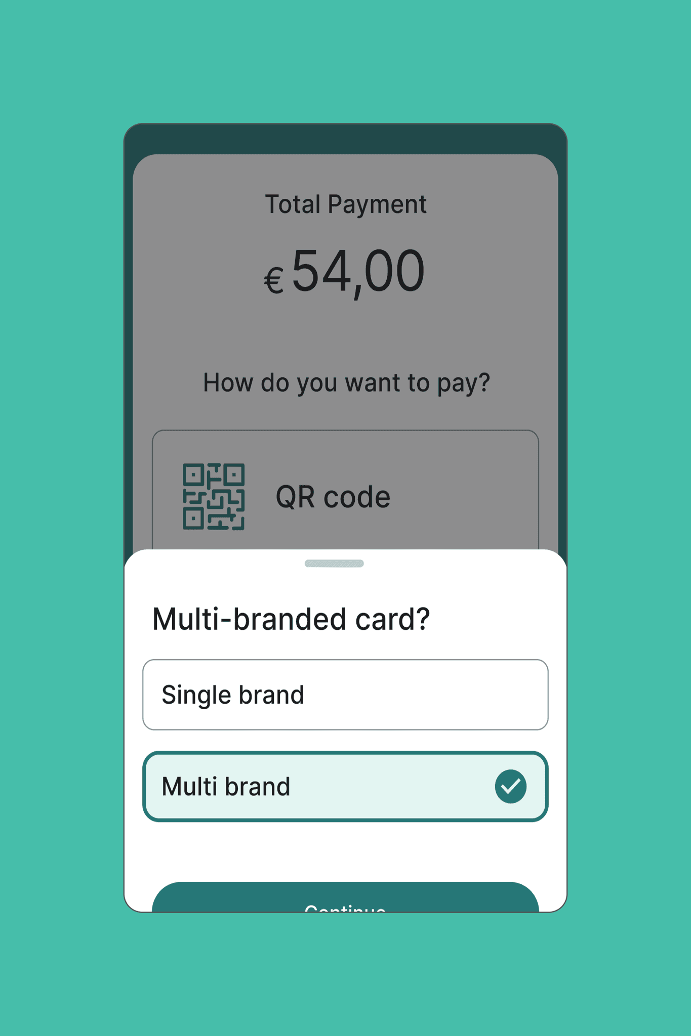
The ‘Tap on Mobile’ app underwent key usability and efficiency improvements for both merchants and customers. I ensured cross-platform consistency, integrated the company’s design system, and streamlined payment flows to cut transaction times.
By addressing design inconsistencies and accessibility gaps, I created a more cohesive and inclusive user experience. Enhanced screens and clearer testing instructions, based on merchant feedback, further optimized the app, setting the stage for ongoing improvements and greater user satisfaction.
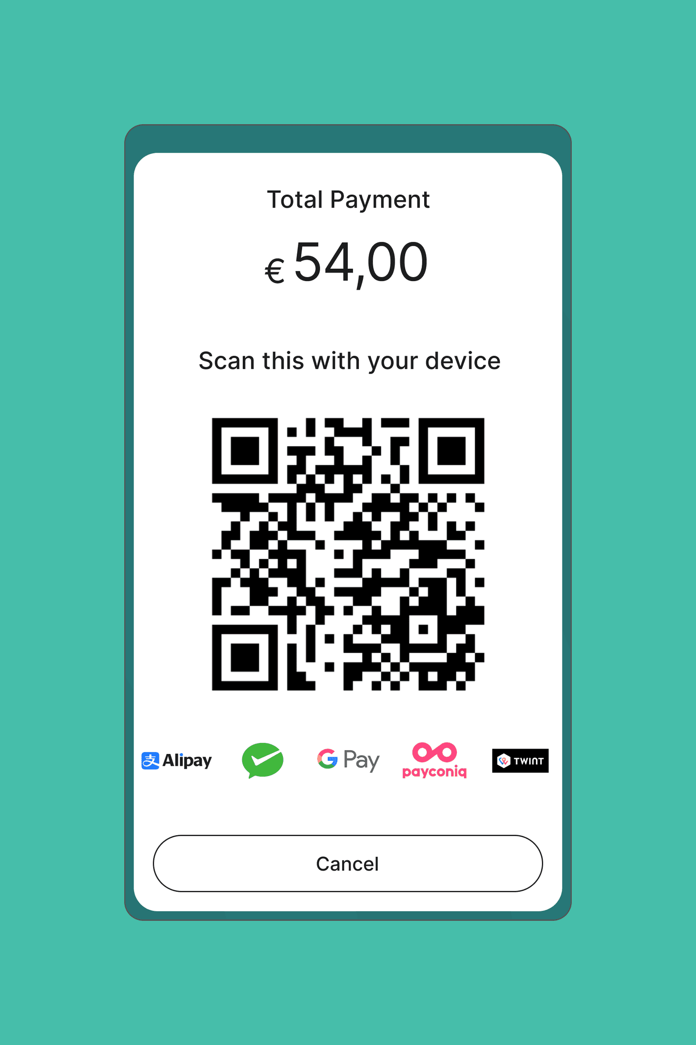
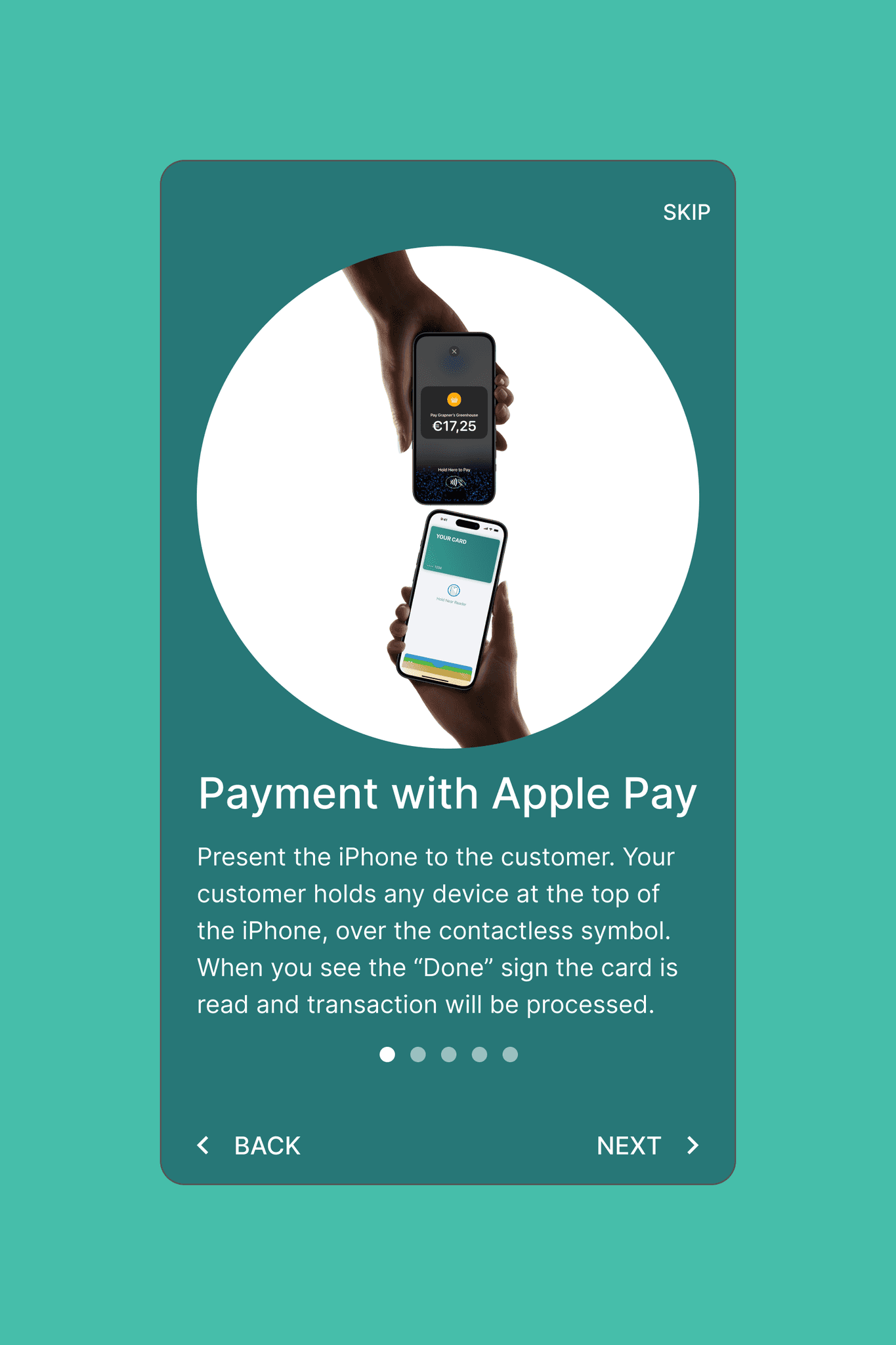
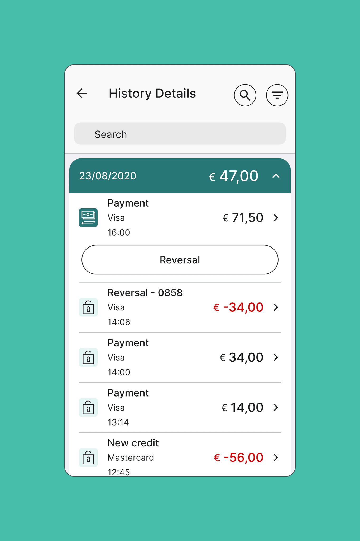
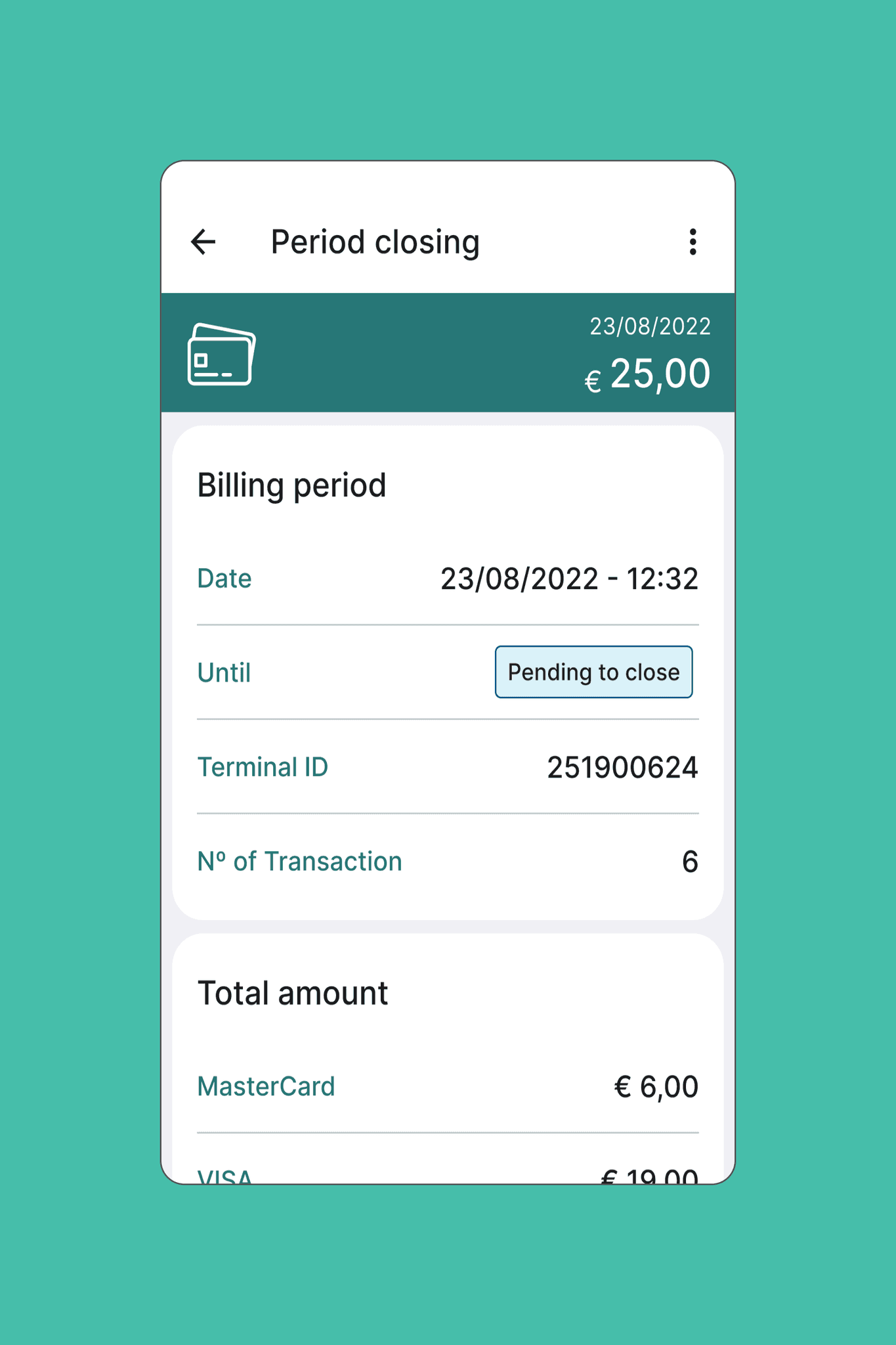
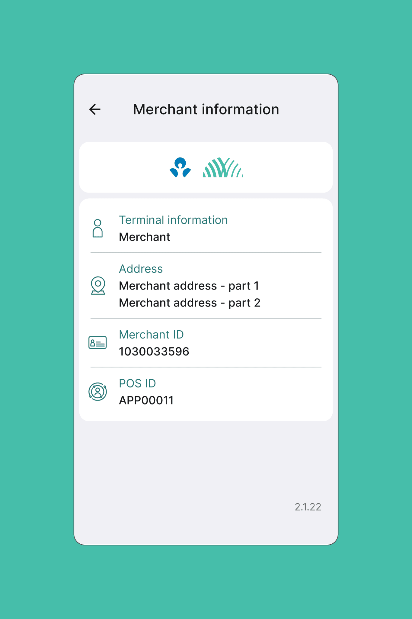